Vector vs Raster
All too commonly, clients just ask us to grab their logo from their website or send us a jpeg of their logo for inclusion in printed material. We always respond by asking for the vector logo which can cause confusion as not many people understand this terminology. So hopefully this blog should make things a little clearer for you.

Raster Graphics
Most images you see on your computer screen are raster graphics. Pictures found on the web and photos you import from your digital camera are raster graphics. If you zoom in on a raster image, you’ll notice that as the pixels become larger, the edges and details become blurry and jagged. Images like this do not work for logos as you can scale them down but if you try to make them bigger they are going to become hazy and lose quality. Not ideal when you are creating a professional looking logo. If the file extension ends in .BMP, .PNG, .TIF, .GIF, .JPG then they are raster images.

Vector Graphics
Unlike raster images, vector graphics are not made up of pixels. They are comprised of paths, which are defined by a start and end point, along with other points, curves, and angles. A path can be a line, a square, a triangle, or a curvy shape. These paths can be used to create simple drawings or complex diagrams.
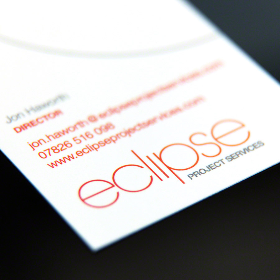
We use Adobe Illustrator to create all our icons and logos so that they retain that crisp quality no matter what dimensions they are scaled to. Files that end in .AI, .EPS, .PDF, or .SVG typically contain vector graphics.
Advantages of vector format
- Scalability: The logo design will be used in different situations, be it large or small. For example it could be blown up for use on an exhibition stand or shrunk down to go on a letterhead. One of the main advantages of vector images is that you can scale the logo up or down without any loss of quality.
- Easy to edit: Each component of a vector graphic can be manipulated. When creating the logo the client may decide that they don’t like a particular element of the logo. Instead of starting from scratch we can just modify the particular area, colour, font etc that the client wants. This saves time and avoids unnecessary stress.
- Small File Sizes: Vector images are formed mostly by simple gradients or flat colours. This means they don’t take up too much space and are easy to transfer or store on computers
- East to export to different formats: Once we have made the vector logo, it is very easy to save this file as a different format (jpeg etc) depending on how the client would like to use it. We always supply the vector logo along with any other format the client desires.
So there you have it – a vector format is required to make sure that your logo looks as professional printed as it does on screen! We hope this blog has helped you understand the terminology a little bit better.

The Power of a Brand Image
Collins English Dictionary defines brand image as “the attributes of a brand as perceived by potential and actual customers.” A company’s branding is a lot more than just their logo as it encompasses everything from their employees dress code to their website to the service they provide. Quite simply put, it’s anything that consumers can see and therefore make a judgement on. We’ve put together some key points to think about when developing a powerful and meaningful brand.

Making the right impression
Brand identity is the term coined for how the company wants to be portrayed and if this doesn’t exactly mirror the brand image then you may struggle to attain your desired customer base. You and your customers should be on the same wavelength and they should understand exactly what they are getting from you. A strong brand will build confidence, which in return produces loyalty with customers that keep returning for repeat business.
Keeping consistency throughout
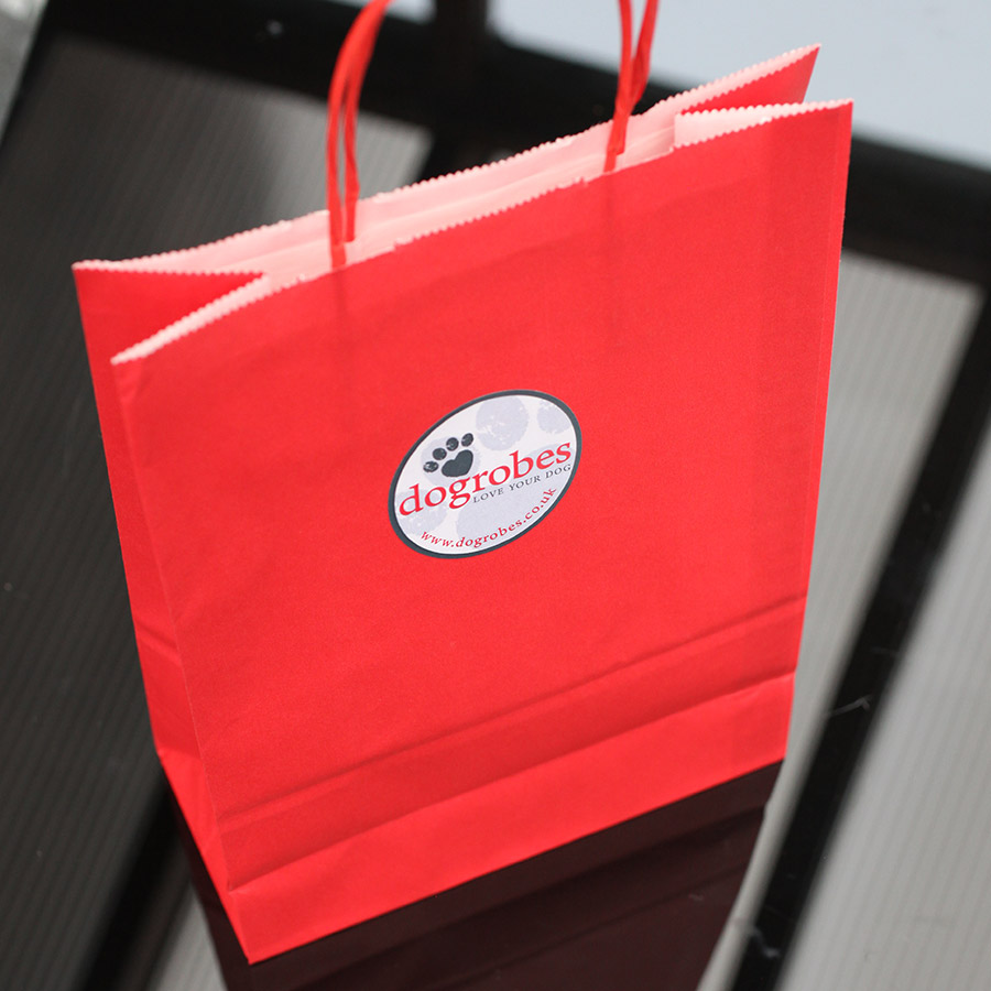
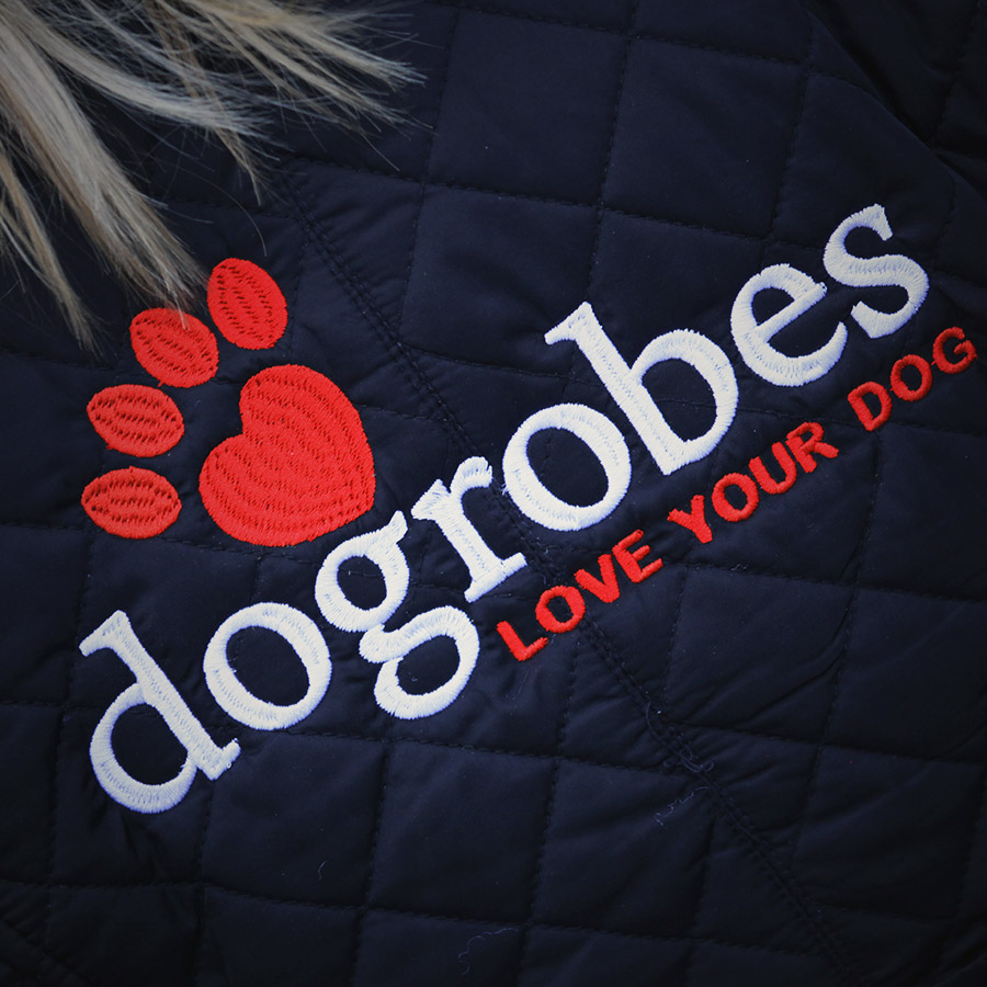
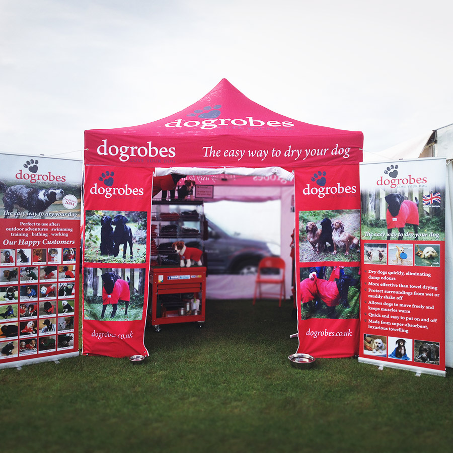
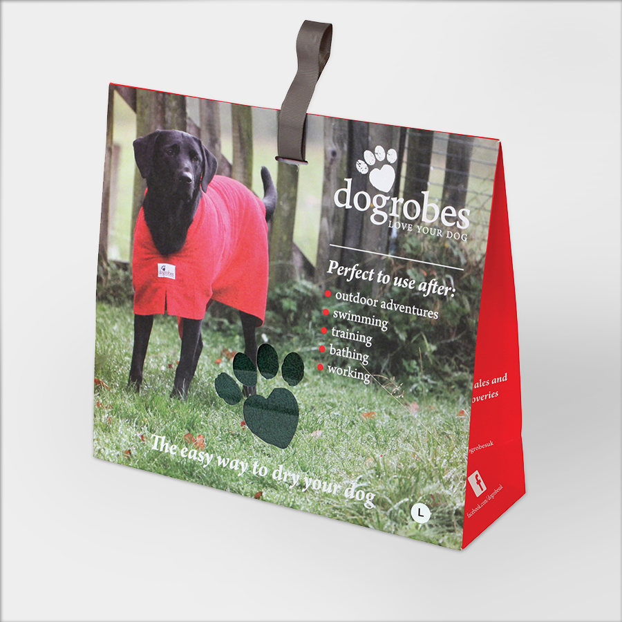
You want the visual elements of your brand to be easily recognisable so that people can, at a glance, identify you and distinguish you from your competitors. We’ve been working with Dogrobes since 2013. The first step in the process was to create a striking logo and establish brand colours. This was utilised on the product itself, business cards, packaging, letterheads, gift bags, advertising, and signage to name just a few.
Reflect your company’s personality
This means assigning human characteristics to a brand in order to make it relatable and to connect with your target audience. Just like people, no two companies are the same. You want your company to be friendly and approachable and your customers should be able to see themselves, or what they aspire to be, in the face of your company.
Brand guidelines
Brand guidelines are essentially an owner’s manual of how to “use” your brand. It is important to create a comprehensive document like this to list the specific colours, fonts, imagery, taglines etc in your brand and ensure it is used correctly across the board. For example, if you were having an advert created for you in the paper, the guidelines could be helpful by stating how far from the edges your logo should be placed and the amount of whitespace that is acceptable around it. It’s small details like this that are important in helping to maintain integrity.
When it comes to building an impactful brand the devil is in the details. It’s important that enough time and attention is allocated to the actual brand itself and not just the logo. Think of it like a jigsaw, with all the small components of the business interlocking firmly together to create an overall image of your company. Once you have everything laid out, that’s half the battle and you can rely on us to help you piece them altogether in the correct order.

6 Golden Rules of Logo Design
A successful logo provides an instant visual communication of your brand and it is often the first thing your customers see. With this in mind, we’ve put together our 6 golden rules of logo design
1. Be unique
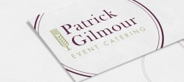
We always listen to what the client is after and we do this by building up a mood board of your company and discussing in depth the direction you would like to take the logo in. We then look at the competition in your particular field and choose a route to go down that is not predictable or cliché. When asked to design a logo for Freelance Chef Patrick Gilmour it would have been all too easy for us to hark back to the classic chef’s hat but instead we wanted to show the journey from “field to fork”. The finished product was an elegant icon that had the added benefit of looking like a glass, which neatly tied the whole meal concept together.
2. Simplicity is key
Take a moment to think of all the big brands that have successful icons. Nike could have demanded runners or athletic equipment in their logo; instead they went for a big tick. Simple. Similarly, McDonald’s could have requested burgers or fries to take centre stage in their logo; instead they went for the iconic yellow M on a red background. Believe us when we say, less is most definitely more! A complex logo can be difficult to reproduce and remember when it’s scaled down it’s going to lose a lot of its impact.
3. Choose colour carefully
Your logo has to work in black and white foremost. When picking your palette of colours, remember to keep it simple (there’s that word again!) We recommend just one or two colours at the most. Think about the brand you are trying to convey. An outdoors company, for example, may want earthy tones like greens or brown whereas a corporate company could opt for a muted palette of navy’s and greys. Colour associations can play a role in the decision making process as well. Red can be a very emotive colour, conjuring up images of fire and passion while in contrast blue is a lot more subdued. We always make sure to stick to Pantone references when it comes to choosing your brand colours, this guarantees a consistent reproduction and eliminates the wide variations of shades that can often be delivered by different printers.
4.Typography matters
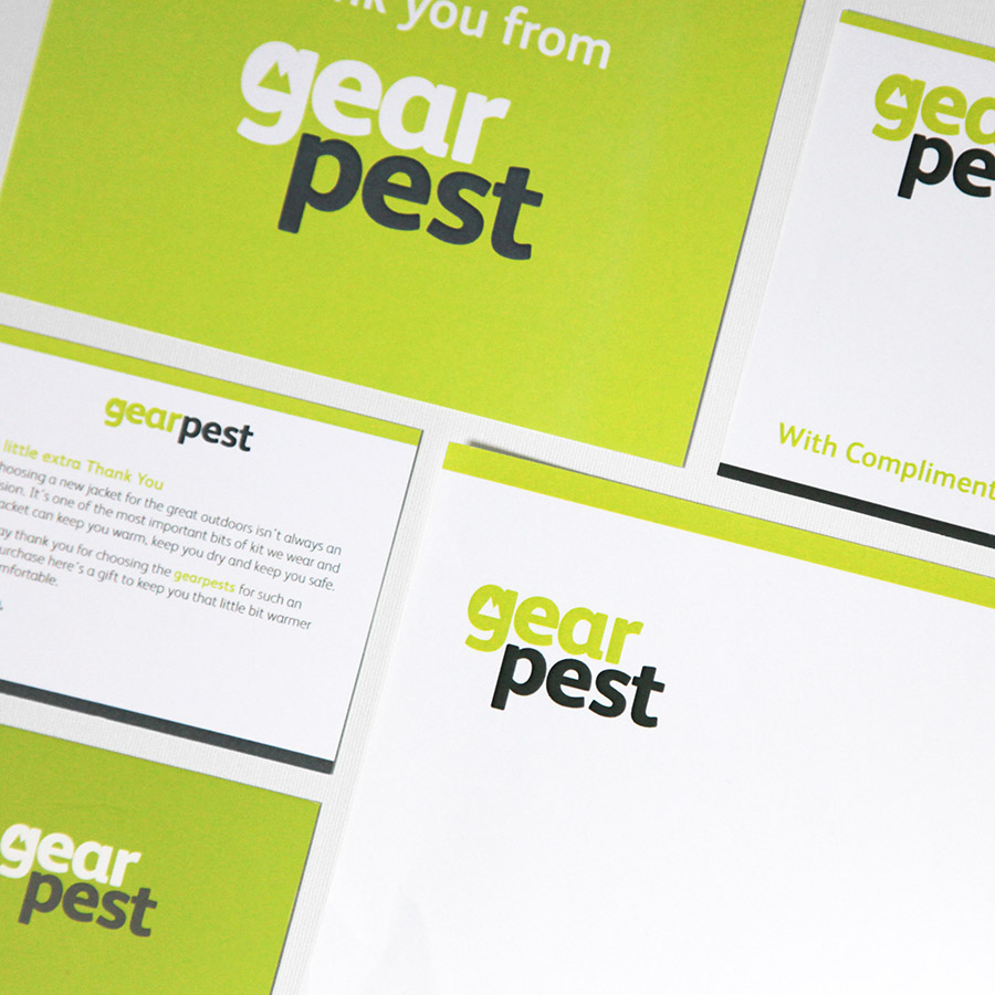
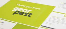
There’s an endless amount of fonts out there and sometimes it can be difficult to decipher just where to start. We, as designers, all have our favourites but we realise it’s crucial to research our clients company before we choose the fonts that we think set the tone best. A serif typeface can look more authoritative whilst a sans serif can give a modern and clean vibe. It often strikes a nice balance to have a mixture of the two between the business name and the tagline. The font can also be modified to include an icon, like the one we created below for outdoor clothing specialists GearPest.
5. Flexibiliy
The visual elements of your logo can be used to create other marketing resources such as stationery, signage and your website. When we are creating a logo we think about how it is going to work on both landscape and portrait formats and we always supply you with variations to choose from. All our logos are created in vector formats, which gives you the flexibility of using it across a range of platforms, scaled up to as big as you like without loss of resolution.
6. Longevity
And finally once we’ve completed your logo we don’t want to be revisiting it again, at least not for a very, very long time. That’s not to say we haven’t enjoyed having you as a client (I’m sure we have!) but hopefully it’s because the design we’ve provided you with will stand the test of time as it doesn’t include any gimmicks or fads. Then we can get onto helping you with the next stage in your marketing journey… long term brand management.